GBV Safe: an app for women facing violence
Design, development and rollout of a gender-based violence information and referral app for the Ministry of Women's Affairs.
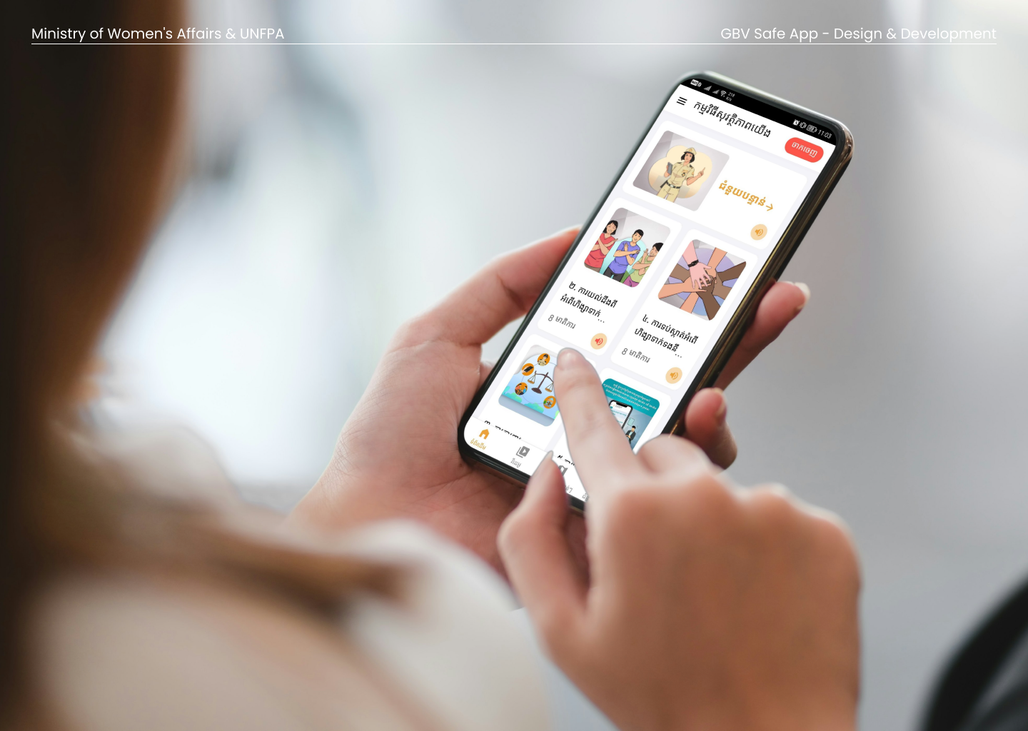
A woman could be put in danger just for having the app on her phone. That was the fact we kept coming back to, and it changed what we built.
The Ministry of Women's Affairs wanted a way to reach women across Cambodia with clear information about gender-based violence: what it is, what their rights are, and where to go for help. UNFPA funded the work with support from the government of Japan, and Glean won the contract to design, develop and roll it out. A two-year project, start to finish.
What we set out to build
We built it on Liferay, the open-source platform we partnered on for enterprise and government work, with a custom mobile app on top for Android and iOS. The app carried information in both writing and audio, so a woman who couldn't safely sit and read still had a way in. It mapped nearby health clinics and shelters, and it connected her to the hotlines and services where she could report abuse to people trained to help.
None of that started on a screen. Our designers went out and interviewed women, the ministry, and their NGO partners, Child Safe Cambodia and the Child Helpline, and worked the findings into wireframes, user flows and journey maps before anything got designed. We wanted to understand what a woman actually needed from a phone in her hand before we decided what the phone should do.
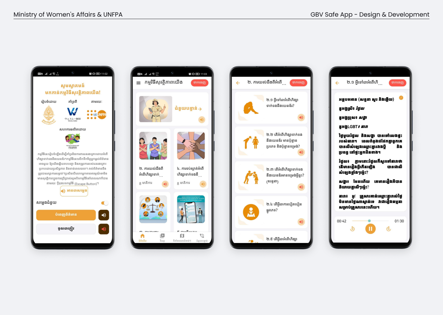 Onboarding, the topic library, and a lesson playing as audio. Every topic could be read or listened to.
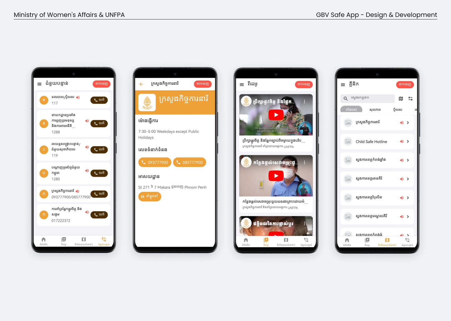 The referral side: national hotlines, service providers with opening hours and directions, and a video library. The app pointed women toward help rather than asking them to log anything themselves.
The safest version reported the least
The first scope was more ambitious about data. It would collect key demographic information and let a woman report abuse directly through the app. Working through the user journeys with the ministry and its partners, we kept hitting the same wall. An app built mainly around reporting is dangerous to have on your phone. If the wrong person found it, the app itself became a sign that she had reached out, and that could bring on the very violence she was trying to escape.
So we changed direction. Instead of a reporting tool, we built an information and referral tool: what abuse is, what your rights are, and where to go to get help from people trained to give it. The reporting still happens, through the hotlines and the clinics and the shelters, not through an icon sitting on her home screen.
We added a quick exit button to every screen. One tap and the app closes, so nobody looking over her shoulder can see what she was reading.
The instinct on a project like this is to build more. More features, more data, more of the problem captured somewhere you can measure it. The safeguarding review pulled the other way. Every feature we cut was a way the app could have been turned against the person we built it for. The best thing we could give her was good information, a fast way to reach help, and a faster way out of the screen.
Working on something like this?
Research, design or a good question. All welcome.