A style guide for the Department of Climate Change
A brand style guide, knowledge-product templates and a concept website for the Department of Climate Change, Ministry of Environment.
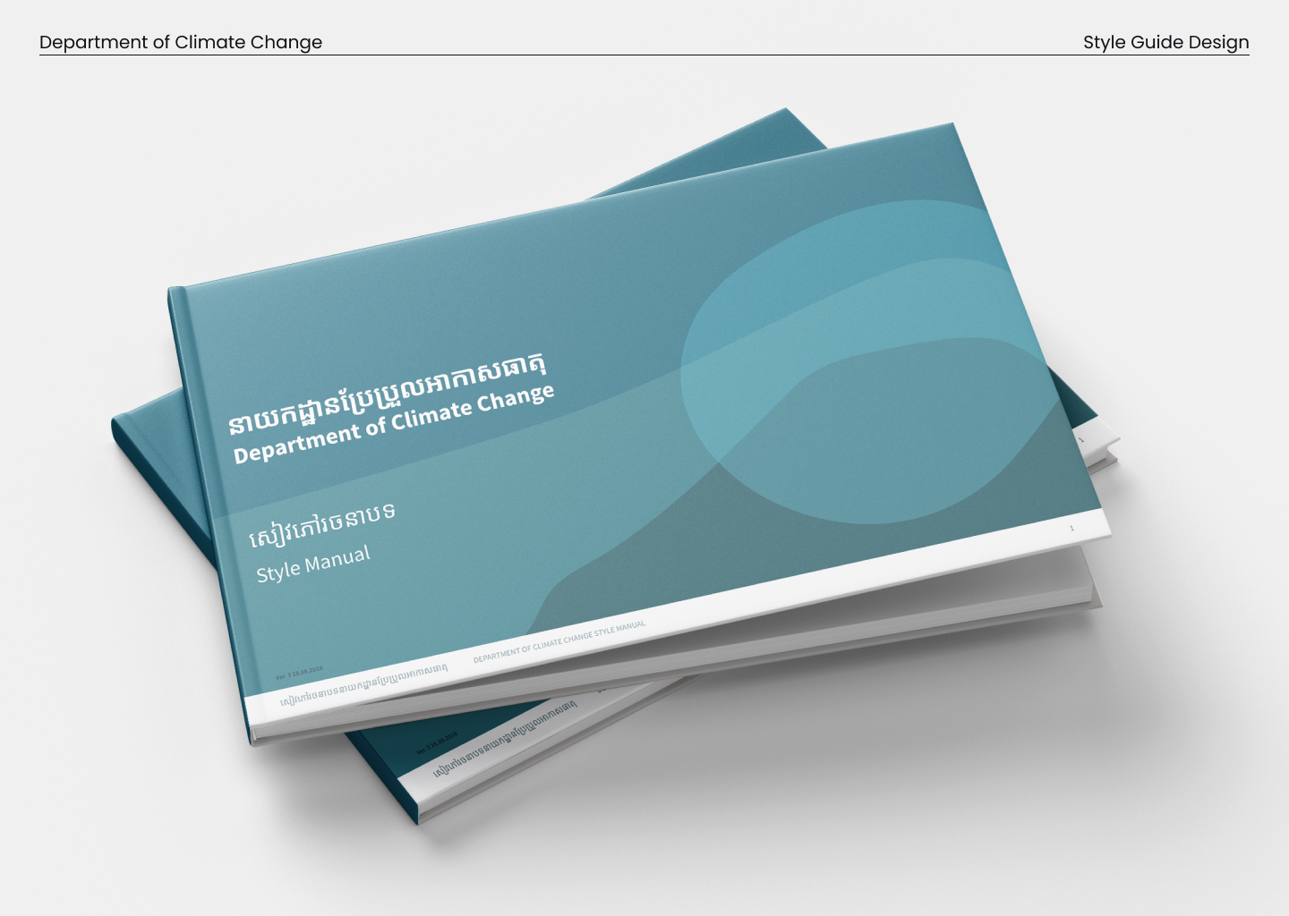
In 2017 and 2018 we gave the Department of Climate Change a book.
The department sits inside Cambodia's Ministry of Environment, and it needed a brand of its own that still clearly belonged to the ministry above it. Our team ran user discovery with the department, met with the minister, the deputy minister and their staff, and worked to understand what the department actually needed before we designed anything.
More than a logo
The core deliverable was a full brand style guide, printed and bound as a style manual. It set the logo usage and clear space, the typography in both Khmer and English, the color palette and the department's own pattern, and it did all of that while keeping the department aligned to the parent ministry's identity.
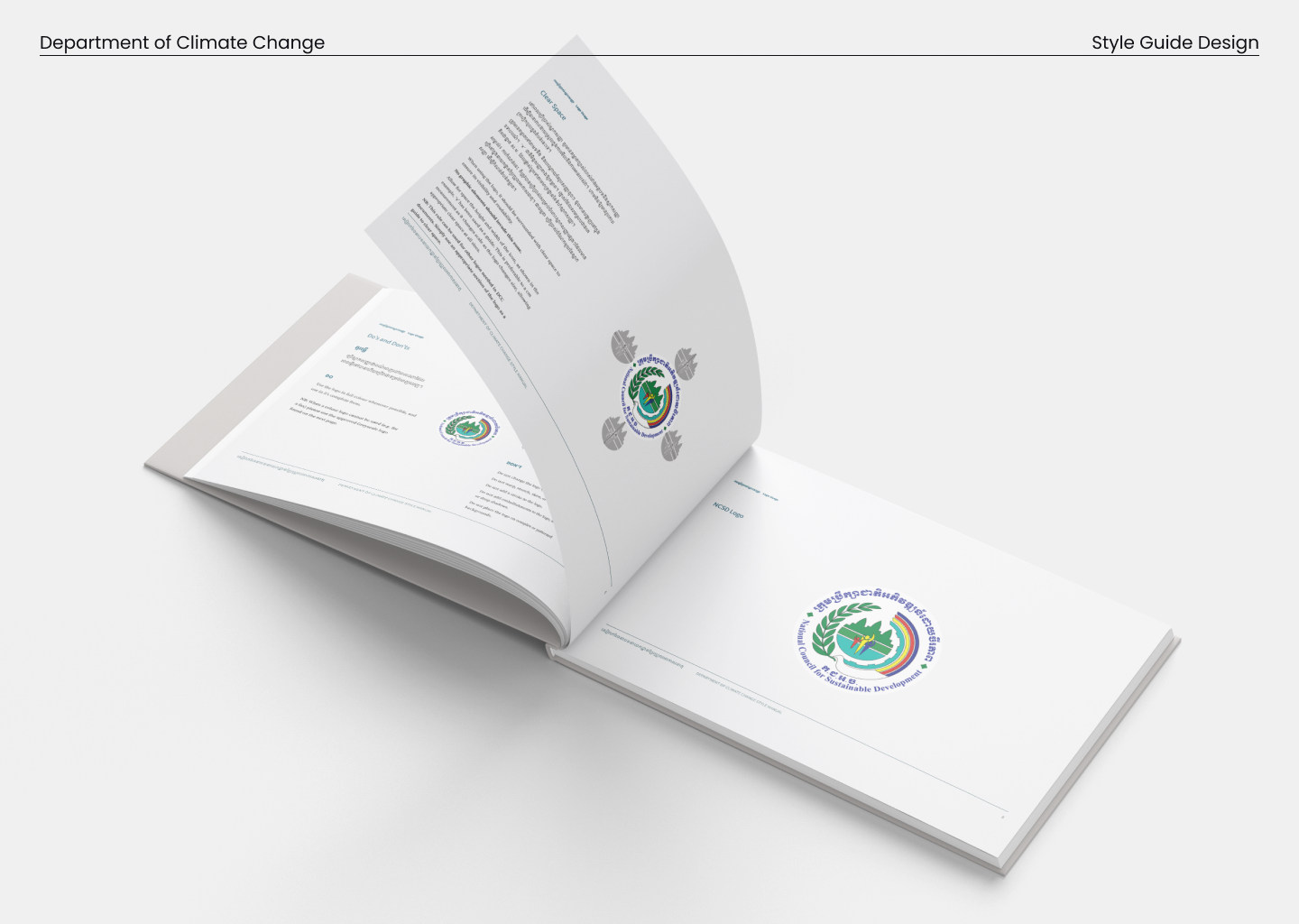 Logo rules: clear space, correct usage and the department's place within the National Council for Sustainable Development.
But a manual on a shelf doesn't change how a department looks day to day. So we worked with the department's technical leads on the knowledge products they produce all the time, the reports and other artifacts, and built seven templates they could reuse. The idea was that the next report and the one after it would carry the brand without anyone having to rebuild it from scratch.
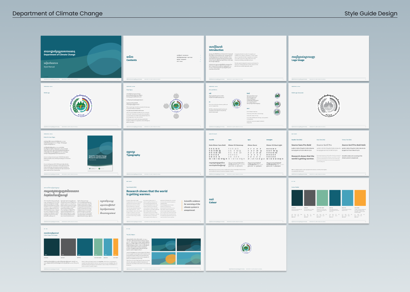 The full system: contents, logo usage, bilingual typography, color and the department's pattern.
A logo is the easy part. The brand is every report, deck and template the department hands out, and that is where the work really went. By the end they had more than a mark. They had a way to look like themselves, on anything, without us in the room.
Working on something like this?
Research, design or a good question. All welcome.