UXO720 - Week 9 - Web Design
This week was all about web design and how to better focus our designs using grid systems, what responsive web design is, and how accessibility issues need to be considered in our web design. This week was of interest in that I started my career as a web designer for a small studio in Seattle, Washington about 15 years ago. I remember attending a conference that my company sent me to where Eric Meyer gave a talk on this new thing called responsive web design and how you could develop a single webpage and have it adjust across the various screen sizes. I remember our development team spending the next week trying to create prototypes to test and having to figure out how to make the website work (hint: they did not) in IE6 and IE7!
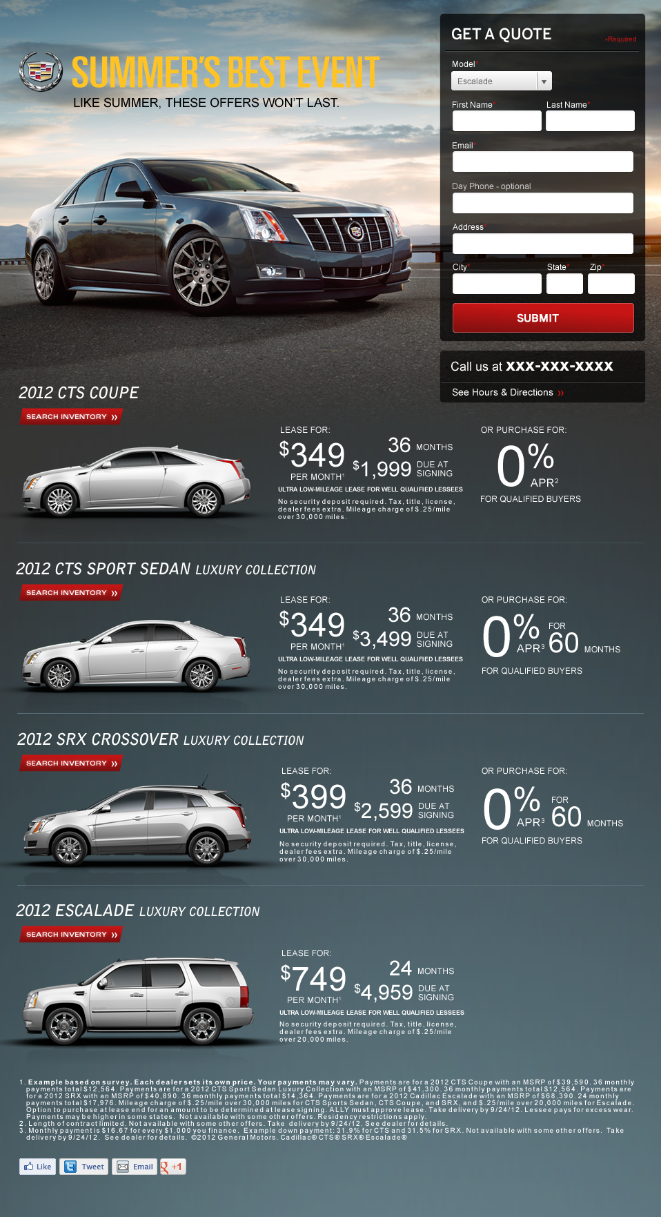
I had to go back and find one my early designs, this is from 2011!
I've been out of web design for the last 8 years and now spend most of my time on product management and design thinking. This was a fun week in exploring what has changed, or hasn't in the time I left this sector of design.
A few interesting things I've noticed:
-
960 grids are still a thing! I used 960 grids when I first started designing websites and it was great to see that they are still in use.
-
Responsive is still around, the goals are the same, but the tools have changed. With the death of IE and better tools like sass, we can do very complex calculations and changes via CSS.
-
Responsive is still difficult. For me it's still a challenge to translate down a design from desktop to mobile. Deciding which elements to move or remove is a challenge. I guess that's why it's important to start mobile first, then add in elements as needed on the desktop.
-
No all functions translate well to mobile. I was working on a table list view for my prototype when I realized that tables are still really difficult to do well on mobile devices.
As part of our design work this week we were asked to design one of our screens on a grid, which I ended up getting to skip because I had already setup my design on a grid! So I took the opportunity to design a simple product listing page on a grid.
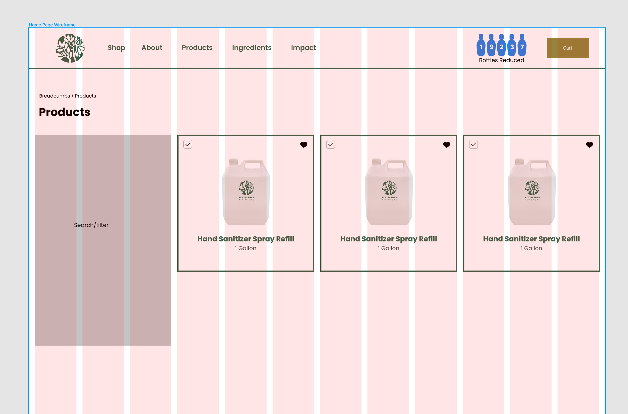
Setting up the product page on a simple 12 column grid
Once this was complete, I moved the design over to a mobile view. I had a difficult time moving elements over to this view, starting with the mobile view tends to be a better approach as you can add in extra elements later, rather than removing elements before.
I did some research and the mobile-first method of design is called progressive advancement. Vincent Xia outlines this in his article on mobile design:
Progressive Advancement means that when we design a product, first we build a version for the relatively lower browser (like that on a mobile phone). This version includes the most basic functions & features. After that, we tend to the advanced version for a tablet or PC, which is created by adding interactions (Xia, 2017).
With this view on the product details page, I’d like to test if having the product image at the top is best or if it should be placed below the add to cart button. In my version, I felt that the goal would be to sell the product, so moving the image below the button would be best. But this is something worth a test.
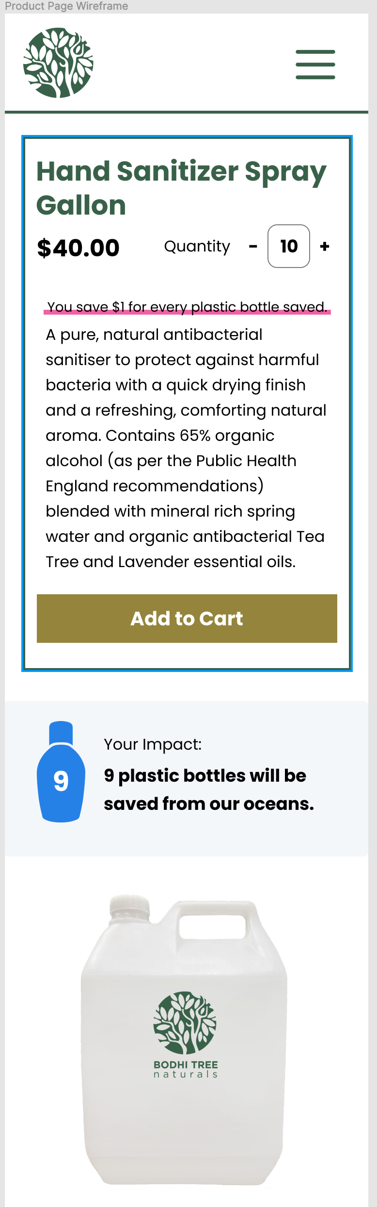
Mobile view of the product detail page.
Next I went back through my design and note a few accessibly issues. I reviewed the designs against the W3 criteria on web accessibility (WAI), 2022).
-
Links are not underlined, which could cause accessibility issues for interaction
-
I don't currently have a focus state, or error state for forms or elements like the product search filter
-
I've setup the website headings h1-h4, but they are not used in any meaningful way on each page, I should adjust these as I redesign these pages
Feelings
I’ve had some difficult feelings around my web design skills this week. Maybe I am getting old and out of date, but it is strange to see how far removed I am from something I cared so deeply for 10 years ago. It was interesting exploring some of the designs my course mates were posting to the discussion forums and see how my designs feel like they are, stylistically, from a much older era in web design. I’m still not sure how to feel about this, but I did appreciate having to go through this topic, even if it felt like clearing the cobwebs out of my head.
** Action Items**
-
Update designs with accessibility considerations
-
Create a homepage design
-
Move from basic visual design to finalized design
References
Meyerweb.com. 2022. Eric A. Meyer. [online] Available at: [Accessed 24 March 2022].
(WAI), W., 2022. Easy Checks – A First Review of Web Accessibility. [online] Web Accessibility Initiative (WAI). Available at: [Accessed 24 March 2022].
Xia, V., 2017. What is Mobile First Design? Why It’s Important & How To Make It?. [online] Medium. Available at: [Accessed 26 March 2022].