UXO720 - Week 10 - Content
This week our topics focused on content strategy, UX writing, and service design. Of these areas I was most interested in the service design topic, as I’ve seen a large need for that type of specialization in my industry. As UX design becomes more mainstream, I’ve seen a lot of need and opportunity here in Cambodia for service design, especially as companies start to take customer touch points more seriously.
One area in which I was interested in exploring more of was the UX writing topic. While I’ve designed some user interfaces before, I’ve never really spent much time thinking about the writing that goes into the various areas of an app.
As part of our work this week, we were asked to conduct a content audit of our prototype. I have never done a content audit before and I was not anticipating that it would help much in this phase of my design, but by taking a look at all my wireframes and exploring their content I was able to see gaps in both the content I designed as well as the need for additional screens.
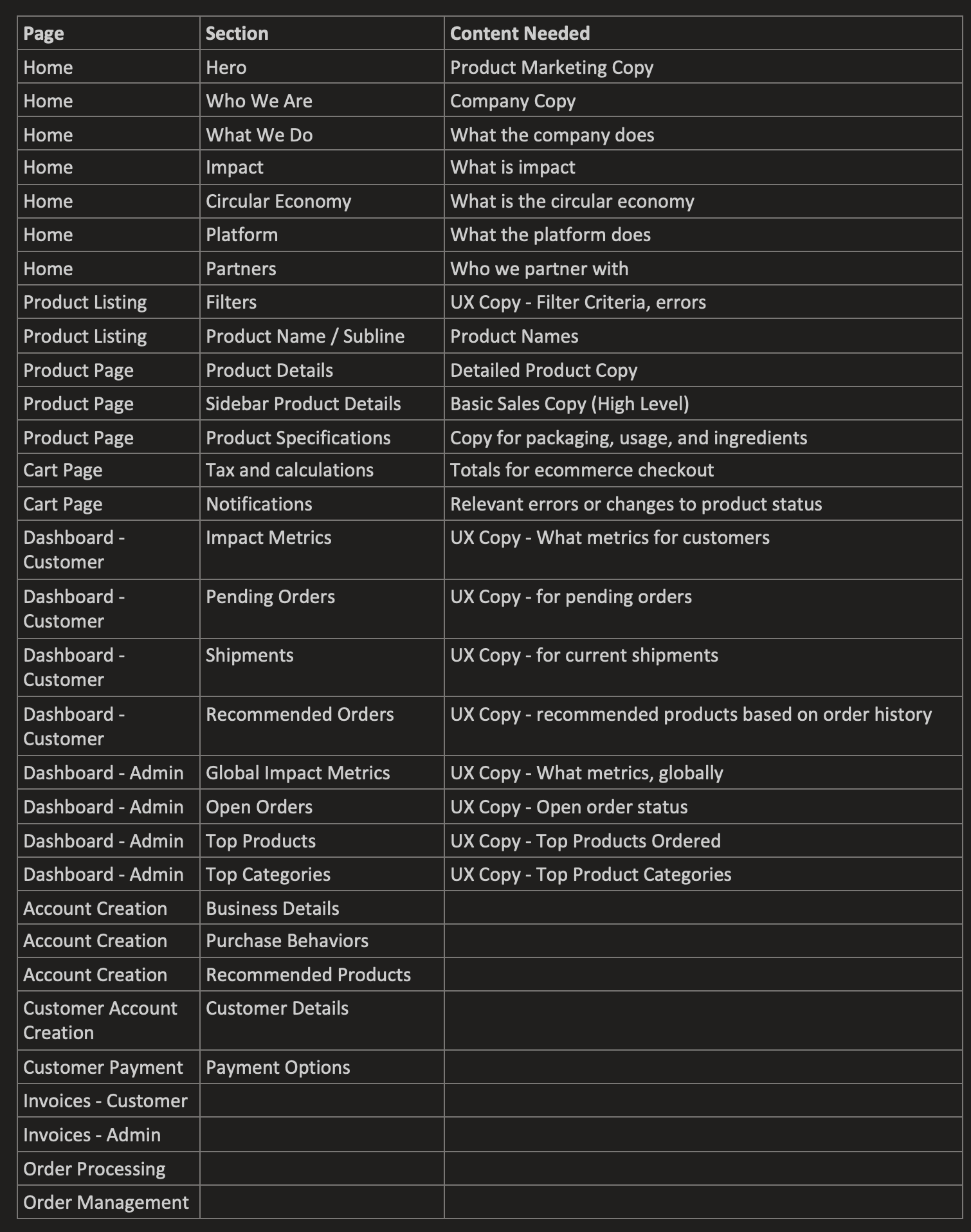
Content audit on my prototype pages. Mapping the page, section, and content needed.
Identify UX Copy in Need of a Makeover
Account creation doesn’t flow very well in terms of on boarding a user into what we are trying to do. Most users would understand the basic ideas of registering, but since we want to help measure the change in product purchasing behavior as well as help recommend products, I need to provide better UX copy to explain this process. I could also, through better UX copy, allow the user to opt out of the product recommendations screen, which will allow them to onboard faster and complete the process.
Reviewing my screens so far, I have not put much attention on UX writing for the screens. I have plans to add tool tips and copy around the impact tracker, but I've yet to do that.
I think the one area where a user might be confused is within the new account creation flow. By drafting some simple copy on what to experience through the new account process would help set the expectation for the user.
Idea for new copy:
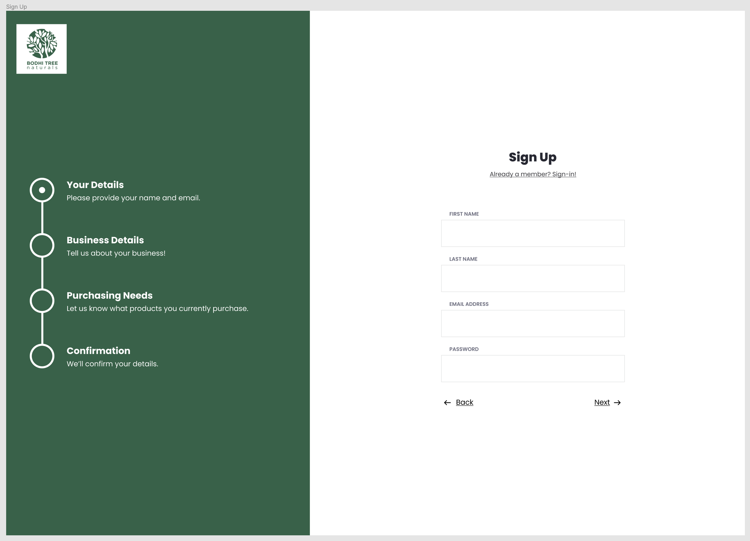
"Your Details - Please provide your name and email address"
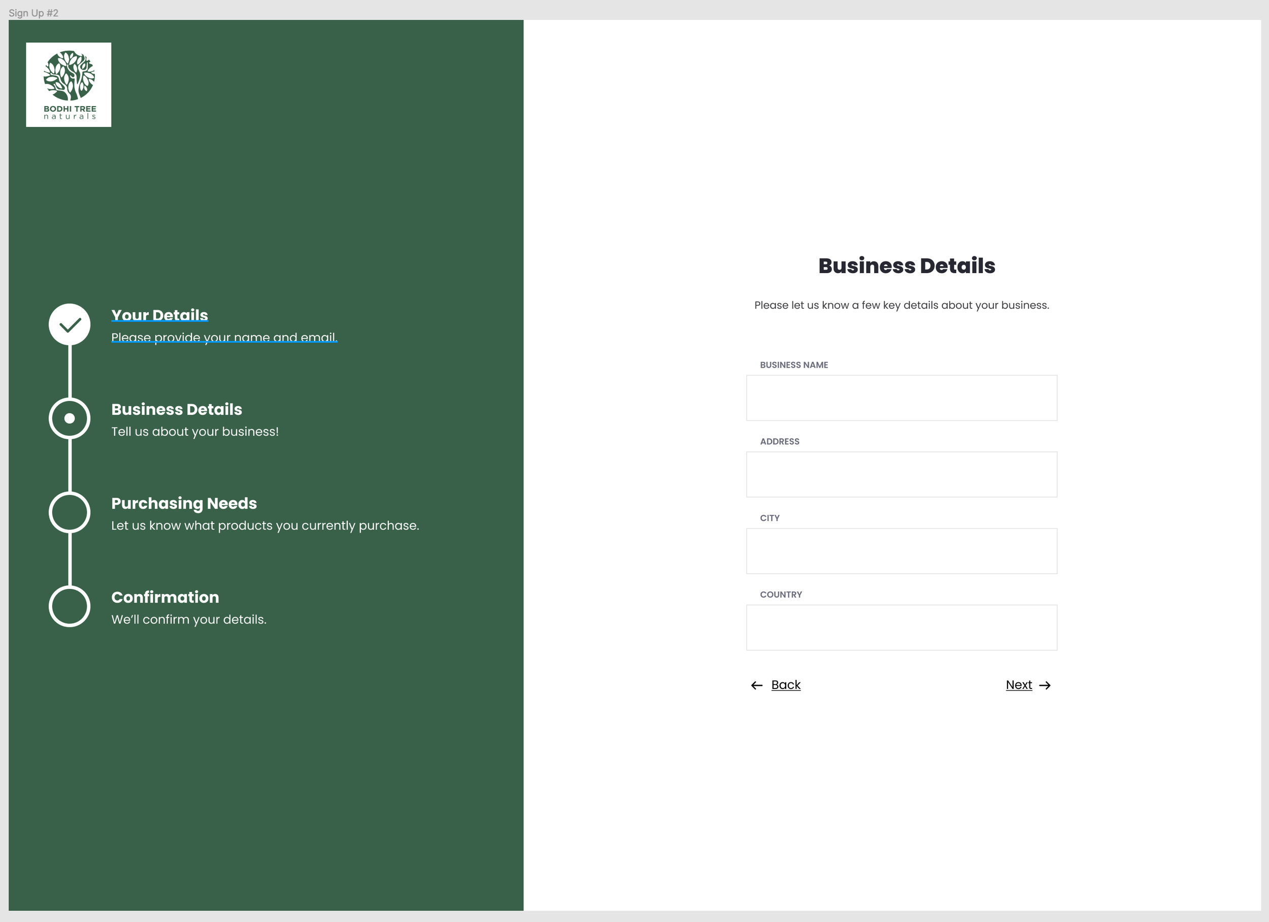
"Business Details - Tell us a bit about your business"
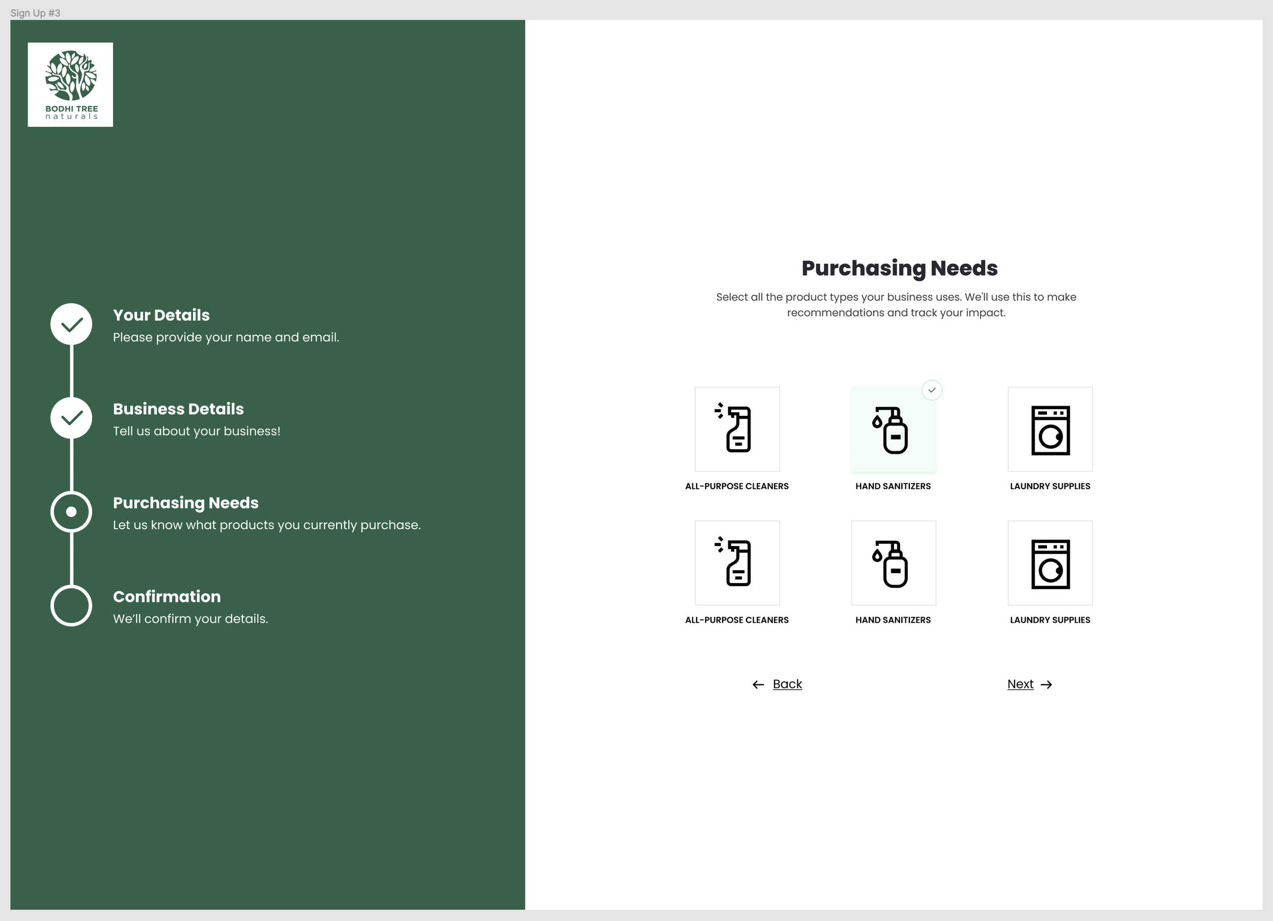
"Purchasing Needs - Let us know what types of products you currently purchase"
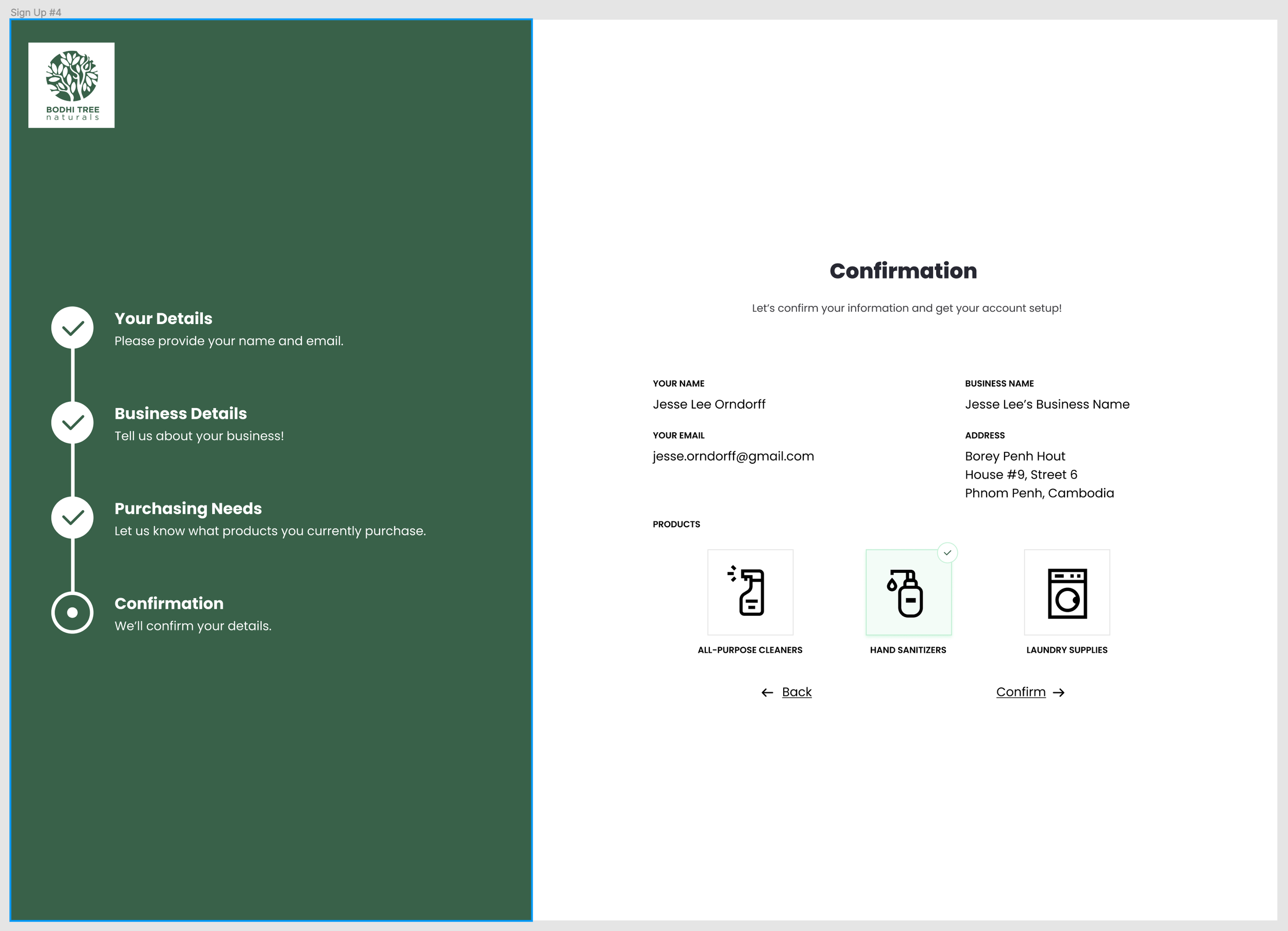
"Confirmation - We'll confirm your details”
I am also trying to communicate the reasons why they should buy environmental products. I think a better approach would be to communicate the need to collect their business information and purchasing behaviors in order to make recommendations on the types of products they can buy. Encouraging the user to let us know what categories of products they buy would help me create a better product recommendation flow.
A New User Registration Process
The outcome from this work was a, what I think will be, a better user signup process. The signup process is focused on collecting the key data that MIV needs, while also keeping the information require light enough so we don’t lose users in the process.
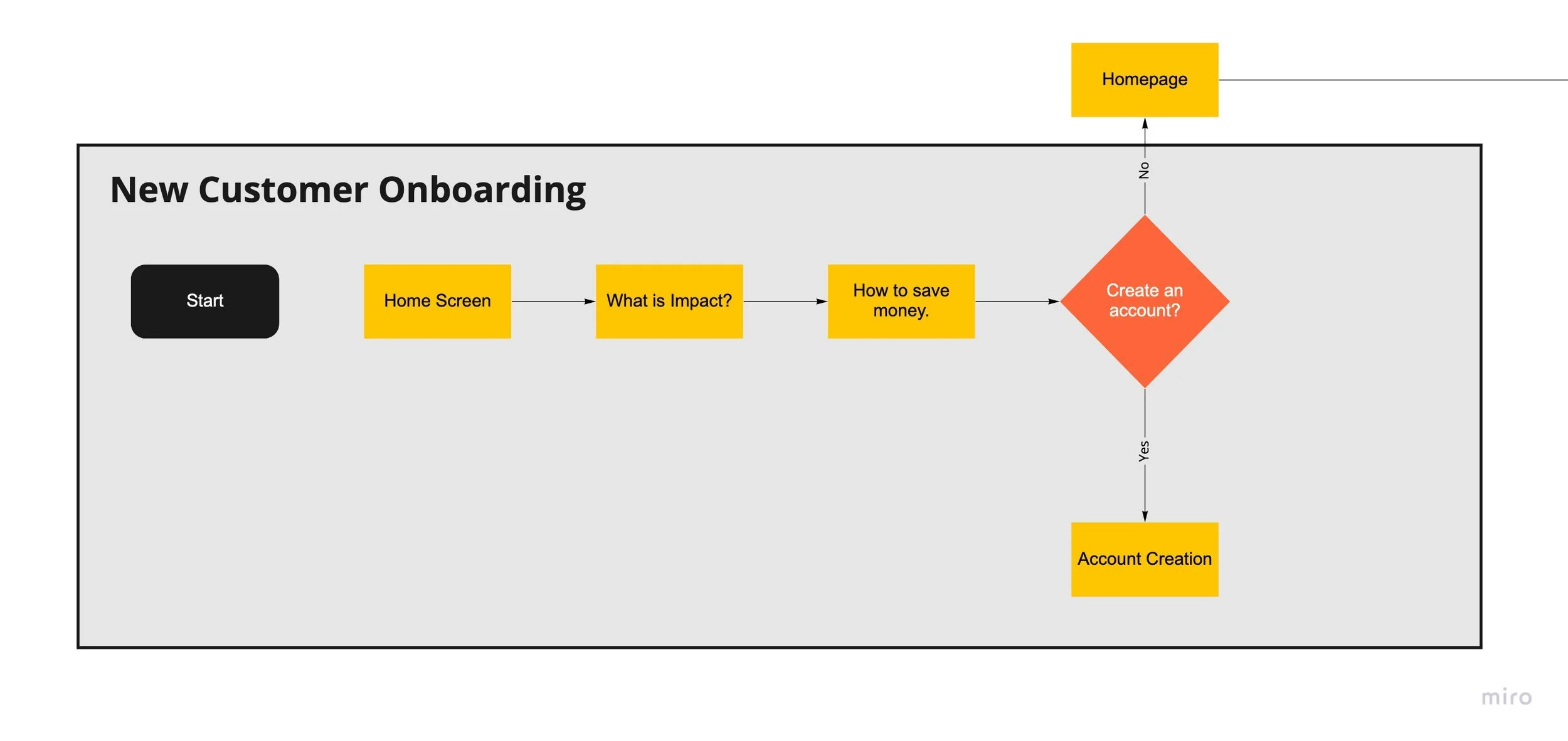
My original user onboarding flow.
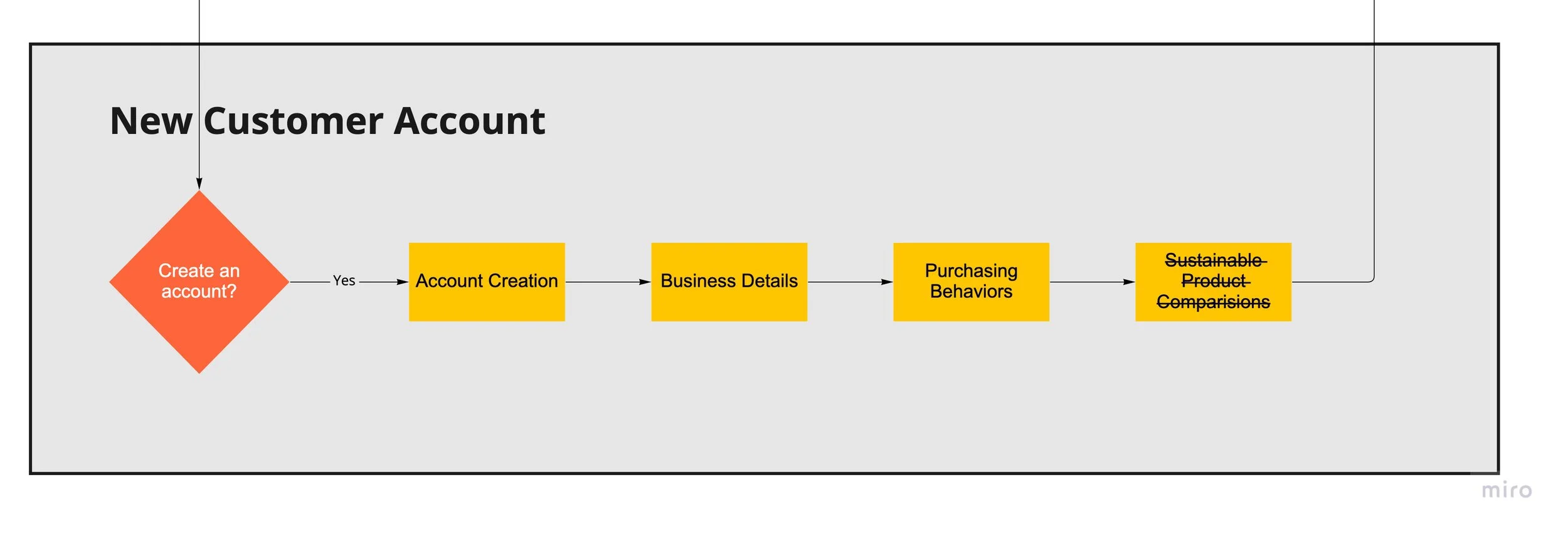
Updated new account process after the content review and IA activity.
Which resulted in the following screens designed for MIV:
As a look forward to next week, I’m still a bit nervous about my final prototype. I’ve realized that I am not ready to use Figma for prototyping since I am still learning the tool. Coming from a web development background, I was thinking about coding out the HTML/CSS but that might take too long.
I did watch a great video from Webflow on how Figma and Webflow can work together, so that might be where I end up focusing my efforts.
Action Items
-
Decide on a prototyping tool to finalize the MIV site, I’m not very good at Figma, thinking of using Webflow
-
Review CRJs and pull any relevant documentation for case study.
Resources
Webflow.com. 2022. Webflow vs Figma (and when to use them) | Around the Web | Webflow TV. [online] Available at: [Accessed 29 April 2022].