GDO710 - Week 3: Rapid Iteration
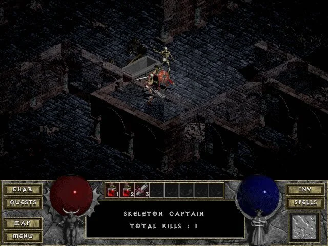
This week I wanted to try to work on the user interface for a game. Inspired by Morwenna's brilliant work posted earlier this week I thought I would take a look at one of my all-time favorite games: Diablo. My goal with this challenge is to take an old, classic game UI and see if I can mock-up what the user interface could look like as a tablet experience.
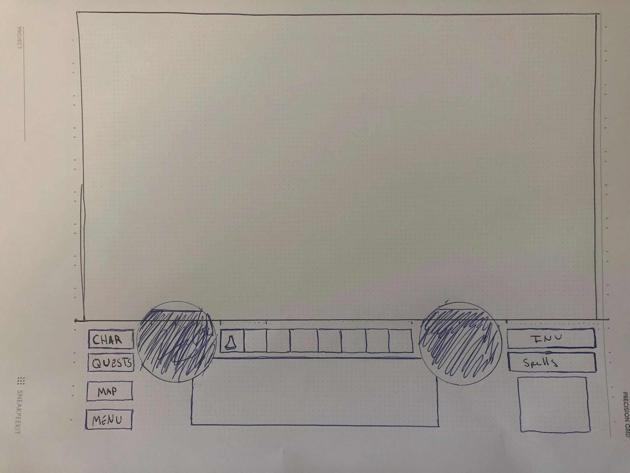
I choose to use the paper mock up method, with the hopes that it would provide me a more tactile feel when holding the tablet.
A few thoughts on this challenge:
-
Translating, even a simple UI, over to paper is time-consuming. I realized that digital mockup tools make this process quicker and more efficient. It's amazing to think about how many classic games were completely designed on paper before being programed.
-
The original UI of Diablo was all very square, but not really grid based. It felt like items were balanced vertically, but not horizontally. There are lots of lines that intersect at interesting points.
-
Modern technology allows for better use of the screen real estate. In the original game the UI was a large block of items at the bottom of the screen, with the interaction at the top.
-
Moving an interface from a mouse and keyboard based interaction to a touch interaction presents new challenges about where I placed elements on the screen. Most notably, consideration about how a user might hold the device became a challenge on where to put the movement controls.
-
I'm curious about the technical limitations of the software and hardware when Diablo was first developed. I wonder how much of the design was made due to the power of the hardware at the time. Which is interesting in contrast of just how much processing power we now have available.
I did some research on the original design and it appears the developers were inspired by id's user interface for Doom. They also used the concept of the "mom test" to make sure their user interface was as simple as possible. David Brevik shared this with GameDeveloper.com:
"One of the things we didn’t like about RPGs at the time is they all had like 25 minutes of character creation before you could get into the game,” said Brevik. And Blizzard North had a lot of love for the menus in Doom, so they designed Diablo’s UI with a lot of thematic inspiration from id’s work, to meet the “mom test” -- “could my mom play this?” Brevik said. The idea was to make something that players could start playing as quickly as possible, with minimal hang-ups" (Wawro, 2016).
For my attempt at moving it to a tablet view I wanted to see if I could move the elements out of the way of the main content, but still keep elements within the reach of the user. I moved the all the menu items to icons at the top as well as the persistent notification window. I felt like those would be used less frequently and the user would be able to endure the occasional reach to the top of the screen.
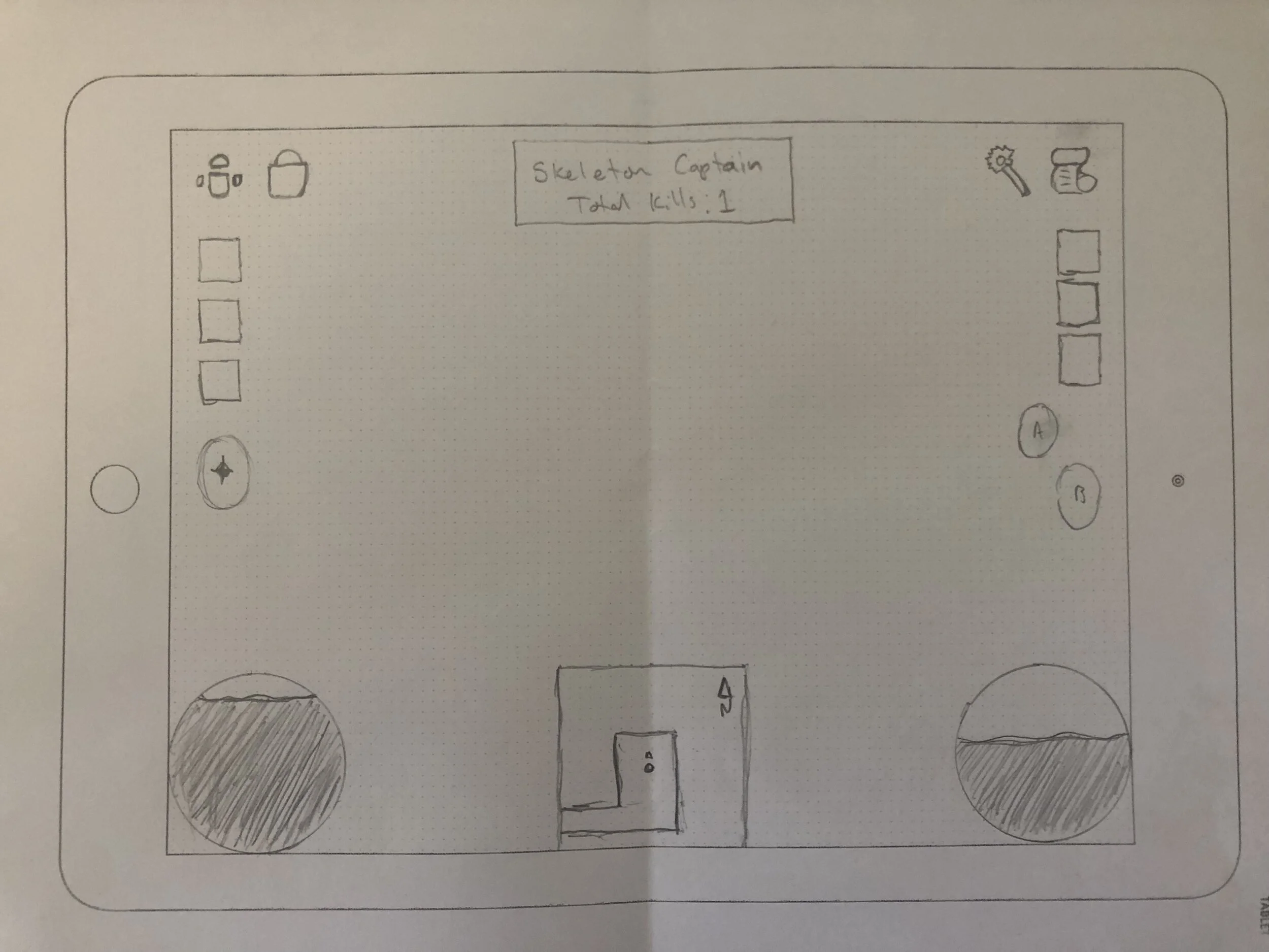
Quick items were moved from the bottom of the screen to the sides, right above the controls. This way a user could easily access critical potions or scrolls when needed.
I kept the health and mana globes as they felt like a staple of Diablo design. These could easily be made into health and mana bars, which would free up even more screen for the game content. Lastly, I added a mini-map to the bottom of the screen rather than a button to switch to map view as in the original.
This process was interesting, there is a lot more to test on this. If I had more time I would love to dive into Figma and get this mocked up on a physical device to see how the interaction would feel.
**References: **
Wawro, A. (2016). 20 years later, David Brevik shares the story of making Diablo. [online] Game Developer. Available at: https://www.gamedeveloper.com/design/20-years-later-david-brevik-shares-the-story-of-making-i-diablo-i- [Accessed 8 Oct. 2021].